

Size is the first question we ask on almost every quote request, and it is the one most people have not thought about yet. They know what the artwork looks like. They know roughly where it is going. But “how big” usually gets answered with a shrug, or with a number that sounds right and turns out to be far too small for the detail in the logo.
This guide covers how patch size is actually measured, the sizes that work for each common placement, and the two things size quietly controls: how much of your design survives, and what the order costs.
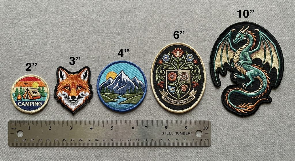
How patch size is measured
This trips up a lot of first-time buyers. Patch size is not the width, and it is not the longest edge. Across the industry, including here, size is the average of the width and the height:
(Width + Height) ÷ 2 = patch size
So a patch that is 4 inches wide and 2 inches tall is quoted as a 3 inch patch. A 5 x 3 inch rectangle is a 4 inch patch. A circle is simply its diameter, because width and height are the same number.
The reason for the averaging is practical rather than arbitrary. Cost tracks the area the machine has to cover and the material it consumes, so a long thin shape and a compact square with the same average dimension end up in roughly the same bracket. It also means a tall narrow shield and a wide banner can be priced on the same scale without a separate table for every outline.
When you send us dimensions, send both numbers. “4 inch patch” is ambiguous. “4 inches wide by 2.5 inches tall” is not, and it saves a round of emails.
Standard sizes by placement
These are the ranges that work in practice. They are not rules, but if your number falls well outside them, it is worth a second look before production.
| Placement | Typical size | Notes |
|---|---|---|
| Left chest | 2.5 – 4 inches wide | 3 inches is the most common single request we receive |
| Sleeve (upper arm) | 3 – 4 inches | Curved shapes need the narrower end of this range |
| Cap front (structured) | 2 – 2.25 inches tall | Height is limited by the panel seam, not by choice |
| Cap side | 1.5 – 2 inches | Small, so keep the design to a mark or monogram |
| Beanie cuff | 2 – 3 inches wide | The cuff fold limits height to roughly 2 inches |
| Name patch / name tape | 1 x 3.5 to 1 x 4 inches | Single line of text, nothing else |
| Back patch (jacket) | 10 – 12 inches | Motorcycle club top rockers usually sit at 11 – 12 |
| Bag or backpack | 3 – 5 inches | Flat panels only; curved panels distort the shape |
| Polo or work shirt pocket | 2 – 3 inches | Must clear the pocket stitching |
The cap number is the one people argue with most. A structured six-panel cap has a seam running up the centre front and the crown starts curving away above roughly 2.25 inches. Push past that and the top of the patch lifts off the cap and catches on things. If your logo is tall, the answer is not a taller patch. It is a redrawn, wider version of the logo for cap use.
What size does to your detail
Every embroidered patch is built from stitches, and a stitch has a minimum useful length. Shrink the artwork and the stitches do not shrink with it — details simply stop being reproducible and have to be merged, thickened or removed during digitizing.
In rough terms:
- Lettering in embroidery needs about 0.2 inches (5mm) of cap height to stay legible. Below that, the letterforms close up and an “e” reads as an “o”.
- Thin outlines under about 1mm disappear into the fill around them.
- Gradients and fine shading need physical room to transition. Under 3 inches, most gradients become two flat colours.
- Small gaps between elements close up. If two shapes in your logo sit very close together, they will touch on a small patch.
Woven patches handle small detail considerably better, because the threads are finer and the weave is tighter. Text that fails at 3 inches in embroidery is often fine at 2.5 inches woven. If your logo is detailed and the placement is small, that swap is usually the fix — our custom woven patches page covers what the format can and cannot hold.
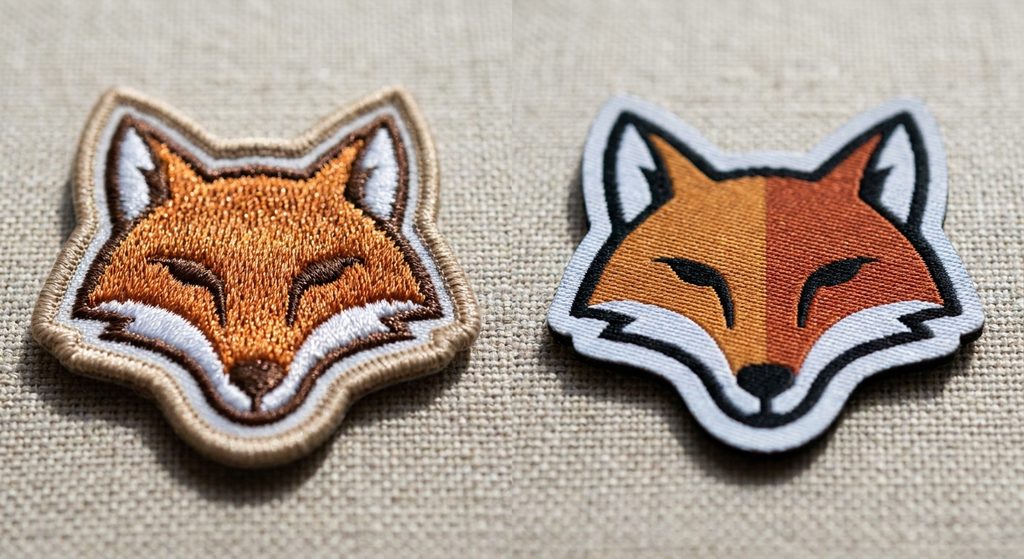
The practical test: print your artwork at the exact finished size on paper, put it on the garment, and stand back three feet. If you cannot read the tagline from there, it will not be readable in thread either.
What size does to your price
Size is the single biggest driver of patch cost after quantity. Going from a 3 inch patch to a 4 inch patch is not a 33% increase in materials — it is closer to a 78% increase in area, and stitch count rises with it.
The other factors that stack on top:
- Embroidery coverage. A 75% coverage patch costs less than a 100% coverage one at the same size, because less of the twill is being stitched over.
- Quantity. Per-unit cost drops steeply as volume rises. The jump from 50 to 100 units is usually more dramatic than the jump from 500 to 1,000.
- Border and backing. Merrowed borders work best on simple curved outlines, while laser-cut edges handle complex shapes. Backing choice adds cost too — there is a full breakdown in our guide to patch backing types and how to attach them.
A common and genuinely useful move: if the quote comes back higher than expected, ask what the same order looks like half an inch smaller. On a 500-unit run, that half inch often moves the number more than switching material would.
Not sure which size suits your placement? Send us your artwork and tell us what it is going on. We will come back with a recommended size and a quote. Request a quote →
Shape changes the usable space
Two patches can share the same quoted size and give you wildly different room to work with.
A 3 inch circle has about 7 square inches of area. A 3 inch shield — say 3.5 wide by 2.5 tall — has roughly the same quoted size, but the tapering bottom means the lower third is nearly unusable for text. Banners, rockers and crests all have this problem: the quoted number looks generous and the workable area is not.
If your design has a lot of text, rectangles and ovals give you the most usable space per inch. Save the shaped outlines for designs built around a central mark.
Sizing for a set, not a single patch
Departments, clubs and uniform programs rarely order one patch. They order a family — a chest patch, a sleeve patch, a cap patch and a name tape — and they need to look like they belong together. Our guide to patches for fire, police and EMS departments goes deeper into building a coordinated set.
The mistake is scaling one artwork file up and down to fill each slot. What actually works is deciding what each patch is for:
- The large patch carries the full design with all its elements.
- The medium patch drops the tagline and any fine secondary detail.
- The small patch keeps the central mark only, at a size where it still reads.
Three versions of the logo, not one logo at three sizes. It costs nothing extra to set up during digitizing and it is the difference between a coordinated set and a blurry small patch.
A short checklist before you order
- Write down both dimensions, not just one.
- Print the artwork at finished size and hold it against the garment.
- Read the smallest text from three feet away.
- Check nothing lands in the tapered or curved part of the outline.
- If the placement is under 3 inches and the design is detailed, ask about woven.
- If the patch needs to be removable, factor in the extra thickness of hook and loop backing before you finalise the size.
- Ask for a sample before committing to a large run.
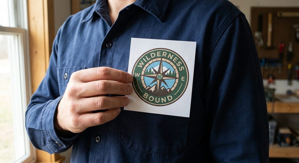
Getting size right is unglamorous, but it prevents the most expensive kind of mistake — a finished run of 500 patches where the tagline cannot be read. Work out the dimensions first, and everything downstream becomes easier.
For a breakdown of which patch format suits which job, start with our overview of the types of custom patches, or send your specs straight through the custom patch quotation form if you already know what you need.